

Once you have your data, know your goal, and have visualized your data, the last thing to do is assemble your infographic. This can be complicated and typically requires many elements. You can always find free templates online to customize for your specific needs.
If you are choosing to design your own, there are a couple of design elements you might want to keep in mind.
Information Flow means how easily a reader can follow the content from beginning to end. When information flows well, each point will naturally connect to the next point, guiding the reader step by step without confusion.
Key elements:
Infographics can take many forms. How you design your infographic alters how someone might read or process the information you provide. Venngage created a helpful visual (below) that explains how different setups impact how an infographic is perceived.

Color is important for any visual element and choosing the right palette for your infographic is integral. Color helps set the tone of the infographic and can help (or hinder) expressing a certain message. Choosing the right colors can be difficult, as you want them to complement but not overwhelm your audience. In addition, it is important to be aware that not all color combinations are accessible to everyone.
Canva has created a helpful tool in assisting you in choosing a color palette. In addition to a color palette generator, the site also offers inspiration, information about color theory, and a guide on color meaning.

Font plays a big role in making an infographic readable and visually appealing. Clean, simple fonts are best because infographics are meant to share information quickly, and readers often skim the text. While fancy fonts might look stylish, if they’re hard to read, they defeat the whole purpose of the infographic.
Key elements:

Just as color is important in conveying tone, font is as well. Different fonts convey different messages and it's important to choose one that is readable and accessible for all. Canva offers a guide to choosing fonts that walks you through typography styles as well as how various pairings can communicate a broad set of messages.
Imagery is essential for conveying information clearly and efficiently. Icons, charts, and other visual elements help simplify complex topics and make the content more engaging and easier to understand for the viewers.
Key elements:
A clever use of imagery is seen below in the brain icon—half is colored and half is white, visually reinforcing the point that 50% of the brain is involved in visual processing.

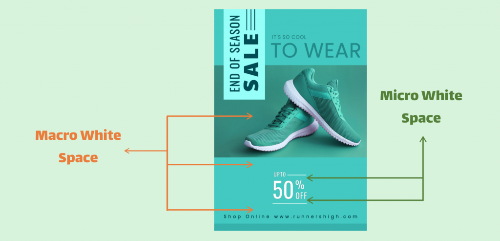
Space helps organize the elements in an infographic. Using it effectively improves readability and allows readers to take in information more quickly. Often called “white space,” in infographics, the right amount can help make a clean organized layout that is visually appealing while creating a more natural flow through the content.